Good Copy Rolex Watches Can Look Convincing Until the Light Changes

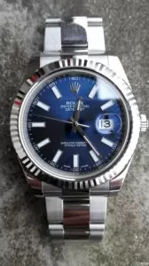
Two blue Rolex Datejust dials sit side by side. Their hour markers are similarly arranged, the lettering appears familiar, and both surfaces have the metallic sheen associated with Rolex’s sunray finishing.
At first glance, the differences seem minor.
Then the light changes.
One dial becomes darker and more restrained. The other throws stronger reflections across its surface, making the radial brushing considerably more obvious. The hour markers also appear slightly different in tone.
That was the observation shared by a member of Reddit’s r/RepTime community in November 2025. The post compared a genuine Rolex Datejust 41 dial with a VSF replica dial, photographed under natural and artificial lighting.
The contributor reported that the genuine dial appeared darker and that its sunburst effect was more subtle. The VSF version, by comparison, sometimes produced dramatically stronger reflections.
The post attracted interest because it challenged a familiar assumption about good copy Rolex watches: that visual accuracy can be established by examining a few carefully composed photographs.
A replica may resemble its genuine counterpart closely under one lighting arrangement without reproducing the same appearance under another.
To understand why, it helps to look beyond the color itself.
Blue Is Not Just Blue
Rolex describes the bright blue dial of the Datejust 41 reference 126334 as having a sunray finish.
That description refers to a manufacturing process rather than simply a shade of blue.
The dial surface is brushed to create extremely fine grooves radiating from its center. Rolex then applies color through techniques such as physical vapor deposition or electroplating, followed by a protective varnish.
Those layers interact with incoming light.
As the watch moves, different portions of the dial reflect light toward the observer. The result is a shifting pattern of highlights and darker areas that gives the surface its characteristic depth.
The visible effect depends on several variables: the geometry of the brushed grooves, the underlying surface, the coloring process, and the final coating.
Two dials can therefore appear similar when photographed directly under diffuse lighting but behave differently when exposed to a concentrated light source.
This is where reproducing a dial becomes more demanding than matching a color sample.
A manufacturer can select a blue pigment that looks convincing in a static photograph. That doesn’t necessarily reproduce the way the original dial distributes reflected light.
The difference may be difficult to notice in one image and obvious in another.
What the VSF Comparison Actually Shows
The November 2025 r/RepTime comparison involved a genuine Rolex Datejust 41 reference 126300 blue dial and a VSF-produced counterpart.
The contributor described three visible differences.
First, the genuine dial appeared darker in both natural and artificial lighting.
Second, its sunburst reflections were less pronounced.
Third, the hour markers appeared slightly warmer and thicker on the genuine example.
The contributor associated the marker-color difference with the use of white gold on the original Rolex dial.
Rolex confirms that its applied dial markers are manufactured from 18-karat gold, making the material distinction relevant. However, the precise contribution of material, surface finishing, and photographic conditions to the observed color difference cannot be determined from the post alone.
Another participant pointed out that replica factory batches can vary.
That qualification is important.
The photographs compare particular components, not every blue-dial Datejust manufactured by VSF. They do not establish a universal defect or demonstrate that every later production batch has identical characteristics.
Nor do they constitute a controlled laboratory comparison.
Lighting, exposure, camera processing, and viewing angle may influence the result.
What makes the discussion useful is the specific visual behavior it identifies.
The observer wasn’t simply saying that one blue looked better than another. The comparison concerned how the two surfaces responded to changing illumination.
That is a more informative question than whether their colors matched in a single photograph.
Genuine Rolex Owners Have the Same Photography Problem
An interesting counterpoint appears in discussions among owners of genuine Rolex watches.
In August 2025, a member of r/rolex posted several photographs showing the mint-green Datejust dial under different lighting conditions.
The images prompted a discussion about how dramatically the color could change.
The owner explained that the dial sometimes appeared gray or nearly neutral, while other lighting conditions brought out a more obvious green.
The difference was substantial enough that the owner initially mistook the watch for a slate-dial Datejust when seeing it in a dealer’s display.
Another owner described a similar phenomenon with a green Oyster Perpetual. Depending on the lighting, the dial could appear almost black or become a much brighter green.
These observations matter because they complicate the way people evaluate replicas.
A genuine Rolex dial does not have one fixed appearance that every photograph should reproduce.
Its color and reflectivity are partly dependent on the environment.
Consequently, a replica dial appearing darker than an official product image is not, by itself, evidence that its color is incorrect.
The official photograph may have been captured under controlled lighting designed to reveal the dial’s intended appearance.
A casual wrist photograph might show something entirely different.
The reverse is also true.
A replica that closely resembles an official photograph may behave differently from the genuine watch in everyday lighting.
Matching a picture and matching a physical object are not the same technical achievement.
That distinction is central to understanding why dial comparisons can produce conflicting opinions.
The Camera Adds Another Layer of Uncertainty
A photograph records light after it has passed through a camera system.
Before the image reaches a screen, its appearance may be affected by white balance, exposure, contrast processing, color profiles, compression, and display settings.
Automatic white balance is particularly relevant when comparing metallic dials.
A camera attempts to interpret the color of the illumination. If two photographs are taken under different conditions, the resulting color adjustments may not be identical.
A blue dial photographed beneath warm indoor lighting can look different from the same dial photographed outdoors.
Even photographs taken under nominally similar conditions can differ if the camera changes exposure or processing between shots.
Reflections introduce another complication.
A small change in wrist angle may direct a strong highlight toward the lens. That highlight can make the dial appear brighter, more saturated, or more dramatically textured.
The viewer may interpret the result as a difference in manufacturing quality when it is partly a difference in illumination.
This doesn’t mean photographic comparisons are useless.
They can reveal genuine differences, especially when both watches are photographed together under consistent conditions.
But they require careful interpretation.
A single photograph is evidence of how a watch appeared under one set of circumstances. It is not a complete description of the dial’s optical behavior.
Three Rolex Dials That Illustrate the Problem
The difficulty becomes clearer when comparing different Rolex dial finishes.
Datejust 41, reference 126334, bright blue dial
The sunray surface produces moving highlights as the watch changes position. Its appearance depends on the relationship between the radial brushing, blue coloring, and incident light.
A convincing reproduction therefore involves more than selecting an appropriate shade of blue.
Datejust 41, reference 126334, mint-green dial
The mint-green version also uses a sunray finish, but its color can appear comparatively subdued in certain environments.
Owner photographs and comments demonstrate how easily the dial’s apparent hue can shift between green and gray.
A color judgment made under one lighting condition may not represent how the watch appears throughout the day.
Day-Date 40, reference 228235, olive-green dial
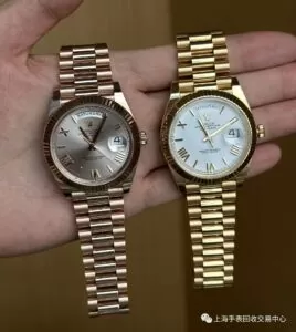
This model pairs an olive-green sunray dial with an 18-karat Everose gold case.
The warm reflections from the surrounding precious metal create a different visual environment from that of a steel Datejust.
That relationship matters when interpreting photographs. The apparent dial color can be influenced by reflections from nearby surfaces, including the case, bezel, and bracelet.
These examples are not interchangeable.
Their colors, surrounding materials, and intended appearances differ.
What they share is the fact that dial appearance cannot be reduced to a single digital color value.
Why the Most Dramatic Photograph May Be the Least Informative
Replica-watch discussions often reward striking images.
A sharply focused macro photograph can make a dial look exceptionally detailed. Strong directional lighting can emphasize the sunray finish, polished markers, and applied logo.
Those photographs can be visually impressive without providing a complete basis for comparison.
Consider a blue Datejust dial photographed beneath a concentrated desk lamp.
The radial reflections may look spectacular. Yet that same lighting can conceal how the dial behaves under ordinary indoor illumination.
A more subdued photograph may actually reveal more about the surface’s everyday appearance.
This creates a tension between photography intended to make a watch attractive and photography intended to document its characteristics.
The two goals are not identical.
For a meaningful visual comparison, it is useful to examine the same dial under diffuse daylight, ordinary indoor lighting, and more directional illumination.
The purpose is not to create a universal authentication test.
It is to determine whether an observed difference persists across conditions or appears only in a particular photographic setup.
A consistent difference is more informative than one that disappears when the camera angle changes.
Even then, photographs cannot establish the authenticity of an entire watch.
A convincing dial may be installed in a counterfeit watch, and a genuine Rolex can contain a replacement or modified dial. Complete authentication requires a broader examination of the relevant components and provenance.
The lighting comparison answers a narrower question: how closely do two visible surfaces behave under observation?
That question is useful precisely because it avoids claiming more than the evidence supports.
The Difference Between an Accurate Color and an Accurate Finish
When enthusiasts discuss good copy Rolex watches, color accuracy often receives more attention than the physical finish producing that color.
The distinction deserves to be reversed.
A dial’s perceived color is partly the result of how its surface interacts with light.
If the brushing is too coarse, the reflections may become unusually strong.
If the surface treatment differs, the transition between bright and dark areas may not resemble the genuine dial.
If the coloring or coating changes the reflectivity, a seemingly correct shade can appear wrong under different lighting.
These are plausible optical explanations, not confirmed diagnoses of the VSF dial discussed on Reddit. Determining the actual manufacturing differences would require controlled examination of the components.
Still, the underlying principle is well established by Rolex’s own description of its dial-making process.
The company does not produce a sunray dial merely by painting a flat surface.
Its visual character results from multiple manufacturing operations.
That makes the dial a useful example of the difference between copying an appearance and reproducing the physical processes responsible for that appearance.
A replica manufacturer may achieve a close visual approximation without using identical materials or production methods.
Sometimes the result may be difficult to distinguish in ordinary photographs.
Under other conditions, differences become more apparent.
Neither outcome should be generalized to every watch carrying the same factory name.
What a Good Copy Really Proves
The phrase good copy Rolex watches is commonly used to describe replicas that closely resemble genuine Rolex models.
But the word good is incomplete without specifying what is being evaluated.
A watch may have convincing case proportions and an inaccurate dial finish. Another may reproduce the dial’s appearance closely while differing substantially in movement construction or bracelet quality.
A successful photograph can establish that a particular watch looks convincing in that photograph.
It cannot establish long-term reliability, material composition, water resistance, or complete authenticity.
The blue Datejust comparison is valuable because it demonstrates the limitations of a purely visual judgment without dismissing visual evidence altogether.
The reported differences in darkness, sunray intensity, and marker appearance identify specific features worth understanding.
The genuine Rolex owners discussing mint-green and other changing dials add another important perspective: apparent color variation is not inherently a defect.
Sometimes it is a deliberate consequence of the original dial’s construction.
That leaves a more precise standard for evaluating visual similarity.
Instead of asking whether a replica looks identical to a genuine Rolex in one photograph, ask whether the evidence is sufficient to support that conclusion across the conditions being discussed.
Often, it isn’t.
The most convincing image may show how effectively a watch reproduces a familiar design at a particular moment.